Articles by Bill Oldham, Brad Smith, Pam Doughty, and Monty Maizles

The August 2018 issue of AUSOM News contains a number articles providing an insight to fonts that arose from a presentation two AUSOM members, Bill Oldham and Brad Smith, gave to the iWork Special Interest Group at July AUSOM meeting.
They provide some useful hints, tips and insights to the use of Fonts and Typography that deserve a wider audience… So, the separate articles by Bill and Brad have been combined here, along with a short tip from Pam Doughty and an amusing sign captured by Monty Maizles.
Please feel free to share a link to this article with your own members.
The Rabbit Burrow
by Bill Oldham
Introduction
The AUSOM News editor asked Brad Smith and me if we would be interested in doing a presentation to the iWorks SIG in July on how to choose a font and when and where to use it.
To make a long story short and to avoid three conflicting opinions of how this came about (Pam, Brad and me), we all agreed that we would enjoy doing this. And we had a grand time putting the presentation together.
The original brief of what font to use for what purpose (such as Flaming Text in dynamic keynote presentations) soon expanded and just became too long to cover in the one session.

Flaming Text in dynamic keynote presentations
So this article hopes to look at some of the areas that we did not have time to cover. It will just be a series of short paragraphs for each of the questions raised after the meeting or while we were preparing for the presentation.
Pressed for time?
Then listen to just this one Ted Talk about the stories that typefaces can tell
Topic 1 — what is the difference between a typeface and a font?
The term typeface refers to all the characters used in a certain style for display. Here is an example of a typeface. The letter is actually raised above the rest of the block for printing. That is where the term typeface comes from.
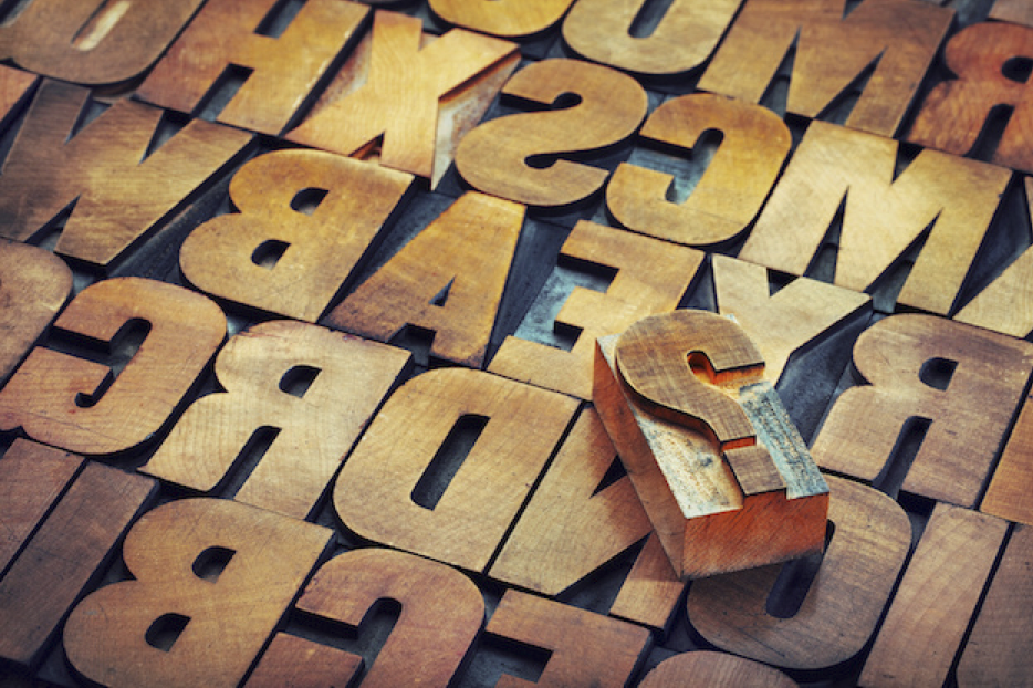
Within each box of typeface, a letter may have a different size or a different style. For example, Word has a typeface called Arial. It has several styles such as Arial Black, Arial Narrow and Arial Rounded Bold. In addition, to the different styles, there are also different sizes of a font. Word offers a range of sizes from 8 to 72 points (a way to measure the height of a letter).
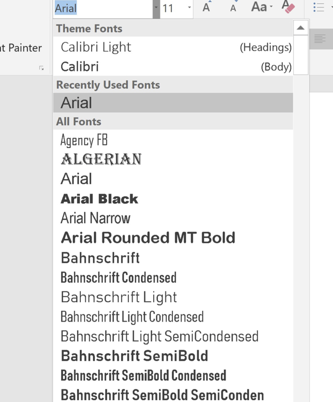
Microsoft Word Font Selection
So we have a typeface that is called Arial that describes the overall look. And we have a slew of letters from small to big and skinny to fat that make up the fonts in the Arial family.
To quote Martin Silverant:
“A typeface is the collective name of a family of related fonts (such as Times New Roman), while fonts refer to the weights, widths, and styles that constitute a typeface (such as Times New Roman Regular, Italic, Bold, etc.).”
So hopefully that gives you an idea of the difference between a typeface and a font, so that you will not be told off by a font addict such as Brad.
Topic 2 — does it look good?
This seems like such a simple topic! You don’t really notice when something that you are reading or seeing on a screen is good. But you certainly notice when it is indecipherable.
Choosing a fashionable font
Well, how about that! While searching for examples of bad layout, I have discovered that my favourite fonts are so out-dated. Cringe! Again. Perhaps there was some truth to the insult from my brother when I was in Year 8 and dressed to kill for outdated first date when he said, “Your clothes make a statement. Too bad it is, ‘I have no taste.’”
So if you want to cringe along with me for finding out that you have no sense of fashionable fonts, please go to “Worst Fonts Ever – 11 examples of bad typography in print“. Here is an example since I started this article discussing Arial.
 Worst Fonts Example — Arial (Flyer) Photo Credit: Carbon Arc
Atrocious punctuation aside, the Arial font used on this flyer is rather flat and boring.
Since Arial was the default font for Microsoft Office for a long time (it has since been replaced by Calibri), it’s gained a reputation for being boring and lazy.
Aesthetically, there’s nothing especially wrong with the font. It’s clean-looking, simple and an almost-passable imitation of Helvetica—but unfortunately, it’s also passé and plain. Arial no longer has the pop it once had, and some would argue it never had pop to begin with.”
Source
What is a hierarchy in a layout?
The terms heading, subheading and body text refer to using a different size and style of a font to organize the text into something that is easily read. Here is an example:
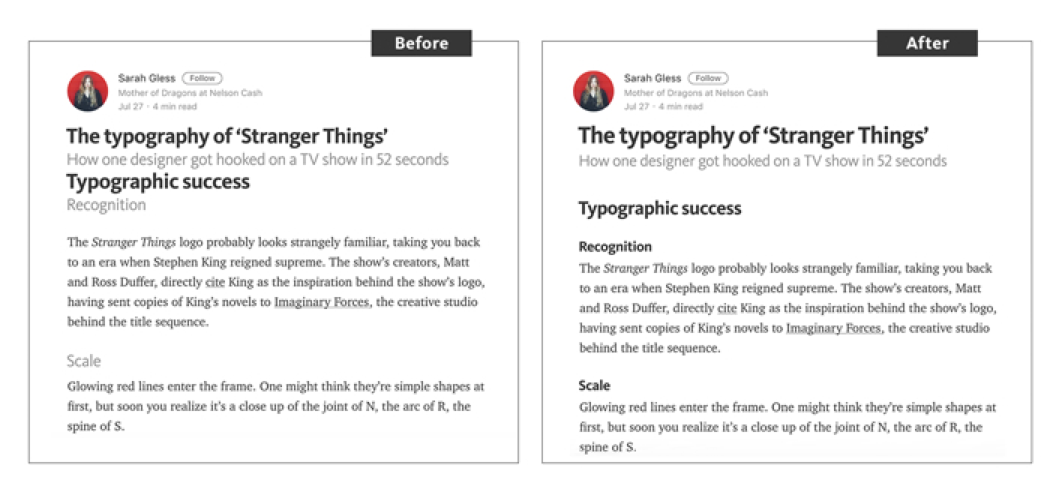
Before and After of Heading, Subhead and Body
If you look in Word under the Home menu bar, you will find a selection of Headings on the right hand part of the menu bar. It looks like this:
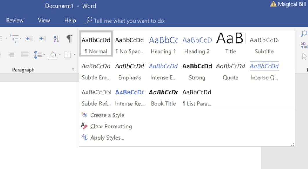
Headings in Word
Here is an example of trying to use these in Word:

This feature of Word takes a lot of the worry out of how to use a hierarchy to make your project easily readable. I am assuming that you are able to organize your thoughts into a logical sequence rather than helter-skelter as you see here. In other Words (pun), please do as I say and not as I do.
What about colours for background and text?
The selection that you choose for text and background colours can be an important part of getting your message across.
Colours can affect the mood of your reader. Here is an example of one colour and its emotional effect.
Create a Mood: In design and branding, nature-inspired colours like green and brown are often chosen by businesses that want to come across as ‘green’ (in the sense of natural, healthy, sustainable, environmentally friendly, organic, etc.).
Such as this branding for a farmers market:

Example of Branding for a Farmers Market
Source
Here is a short summary of colors and emotions. Remember that it is worth what it costs.

The psychology of colour
Source
What about the mood of the font I choose?
Boy, this opens up a whole can of worms. I did not realize all the factors that need to be considered. They might include how the typeface looks, readability (tracking) and legibility (kerning), high contrast, scalability, hierarchy, tone of voice. For more detail, please go to “Evoke Emotion Through Typography“.
Topic 3 — guidelines on this topic
Mary Stribley has some general guidelines.
These are taken from her website at 20 design rules you should never break.
Please have a look at the site for the ones that I have left out.
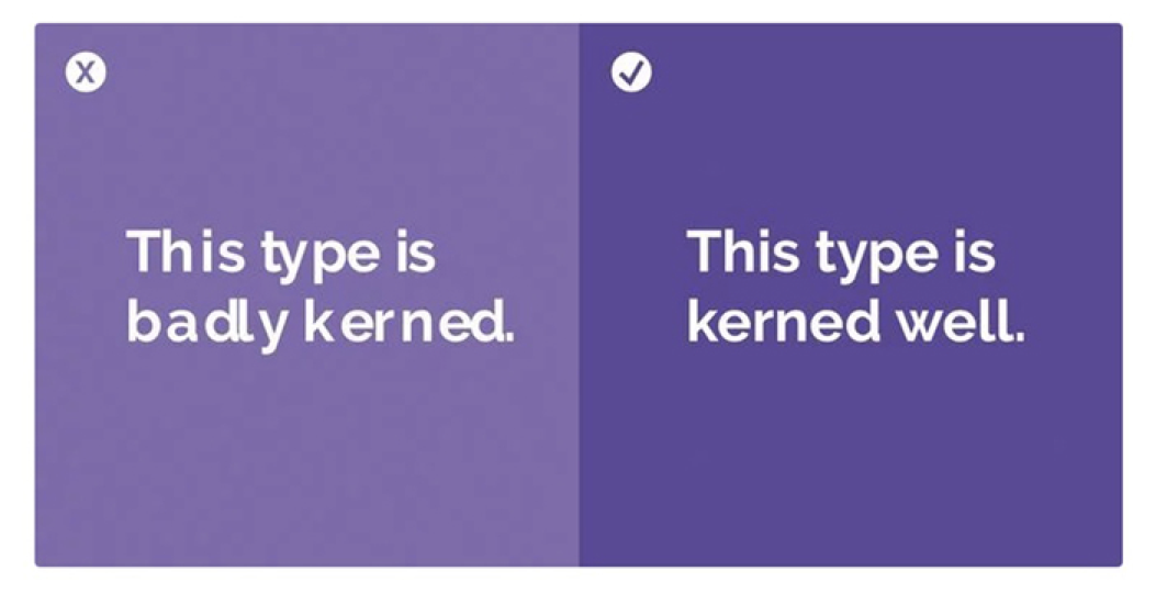
Don’t Forget To Kern
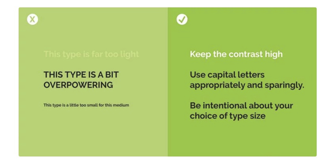
Don’t Disregard Readability/Legibility For Aesthetic Reasons
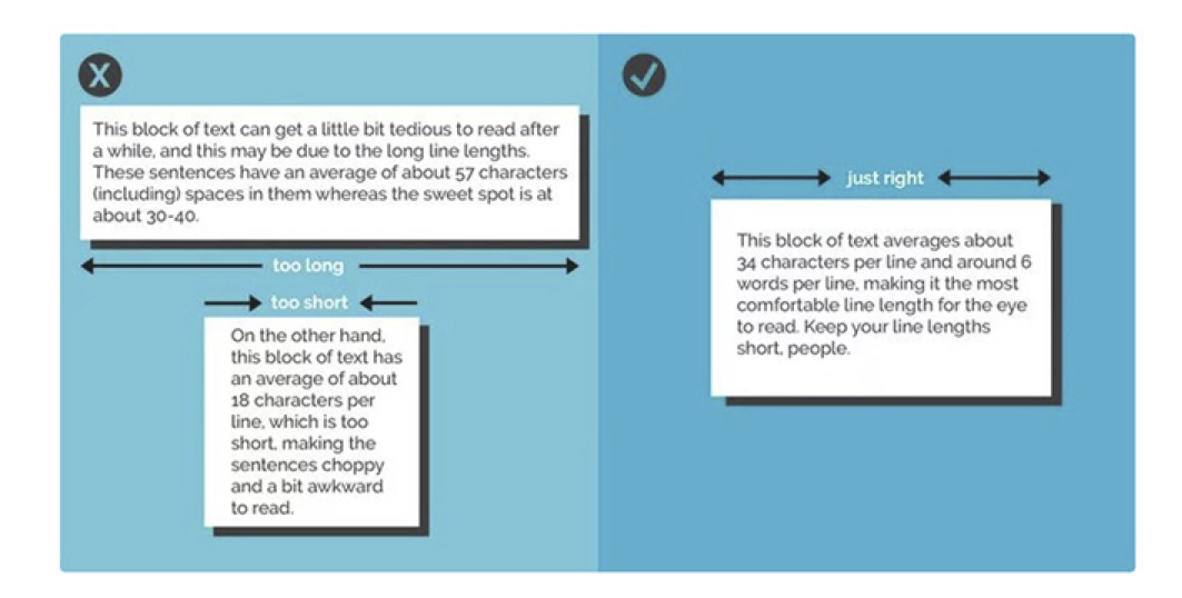
Keep Your Line Lengths Short
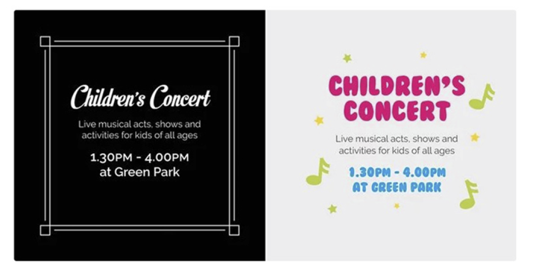
Always Design For Your Audience
Learn The Rules Of Grammar

More from Mary Stribley on grammar.
“Grammar can be a tricky thing, there are a lot of hidden rules that you don’t always know you’re breaking until they’re pointed out. Taking the time to learn some of the design-oriented rules of grammar can keep your designs professional and make you feel delightfully smug when you start to notice others’ errors out in the wild. Let’s run through a quick few now.
First of all, ampersands. Ampersands do not belong in body copy, avoid substituting an ‘and’ for a ‘&’. Instead, ampersands are most commonly used for organization titles (e.g. ‘Johnson & Johnson’) or stylistically within logo/identity design.
Another common error that is easily fixed is double spaces after punctuation. The simple solution? Don’t. One space is more than enough. If you find that your type still looks a little too squashed, perhaps try adjusting your tracking or just switch to a new font.
One more point is hyphens and dashes, something you’re bound to come across eventually, even within this article there have been a small handful. Basically there are three types of hyphens/lines: the hyphen (-), the en dash (–) and the em dash (—). The hyphen is used to join two words (e.g. ‘custom-built’); an en dash is used to connect numerical values (e.g. ‘1984–1998’); and an em dash is the length of an ‘M’ and is occasionally used within sentences to stand in for a comma (e.g. ‘Grammar is hard — or so I once thought’)
There are plenty of rules to grammar, and while it can seem like a relatively unimportant thing to know, a lot of designers would argue otherwise. It is a subtle but powerful tool that can take your designs to a whole new level of professionalism and attention to detail.”
Which fonts should I avoid using?
For a summary of which fonts not to use, just look at the image below;
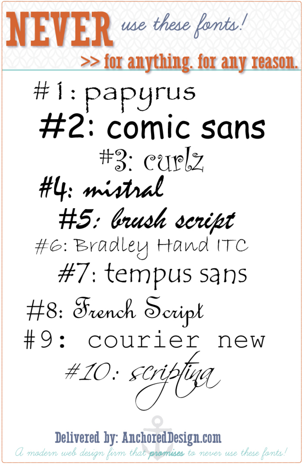
10 Fonts to NEVER use!
Conclusion
Well, that’s it for this month.
Thanks to Brad and Pam for pointing me in the direction of typography and fonts and how to use them for print and screen purposes.
I have to admit that I am still a great fan of Comic Sans and will continue to use it with the door locked and the blinds drawn tight. Oh, the shame of it all!
That’s all, folks.
Fonts: Good and Bad – Plain and Fancy – macOS
by Brad Smith
What is the difference between a typeface and a font?
Originally, the typeface is a particular design of type e.g. the Helvetica Family, while a font is type in a particular size and weight. In short, a typeface usually gathers many fonts. Nowadays, with the digital design of documents, you often see those two words used rather interchangeably. It doesn’t make much sense to say that “Helvetica 12” and “Helvetica 14” are different fonts (they used to be different drawers with different blocks of lead, now they’re all a single Open Type Font file!).

A proportional font could be Times New Roman while a monospaced font could be Courier
True Type Font vs. Open Type Font
TTF and OTF are extensions that are used to indicate that the file is a font, which can be used in formatting the documents for printing. TTF stands for TrueType Font, a relatively older font, while OTF stands for OpenType Font, which was based in part on the TrueType standard.
A significant difference between the two is in their capabilities. TTF depends solely on glyph tables that define how each character looks while OTF is able to use glyphs along with CCF (Compact Font Format) tables. The cubic Bezier splines used by CCF allow for fewer points to be used in defining how a character would look compared to the quadratic Bezier splines used by TTF fonts. OTF also adds a few smartfont features, on top of the snft structure that is being used by TTF, to add additional language support to the fonts. Although it may not have a very significant effect on your computer, it is also worthy to note that the use of CCF in OTF could lead to file sizes that are significantly smaller, given that no special features are used in the font.

Sans Serif font could be Helvetica while a Serif font could be Adobe Caslon Pro
Despite the proven superiority of OTF fonts, especially when using CCF, the use of TTF fonts is still very prolific. It may be taking much longer than expected, but the number of OTF fonts is already on the rise. The reason behind this popularity is the simplicity of making TTF fonts compared to OTF fonts that use CCF. Since there is really no reason to stop using TTF in creating new fonts, most font makers still stick to what they know works, even if it is inferior to the alternative.
There is really no issue for the end user as almost all modern applications that use fonts are able to work with TTF and OTF files. Users don’t need to choose one over the other as they can be used together in creating documents or printing layouts.
Ligatures
A widely used ligature in a handwriting-style typeface. Notice the ‘flourish’ between the top of the T and the top of the H. This is the ligature (a stroke that joins adjacent letters in printing or writing).
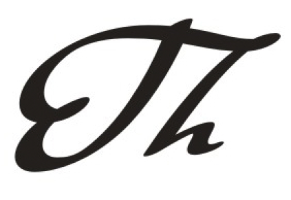
Notice the ‘flourish’ between the top of the T and the top of the H.
Like Ligatures, Glyphs have flourishes added to certain letters of the typeface. Normally used very sparingly, and mostly in formal, celebratory documents such as invitations and announcements, they can add or detract from the page.
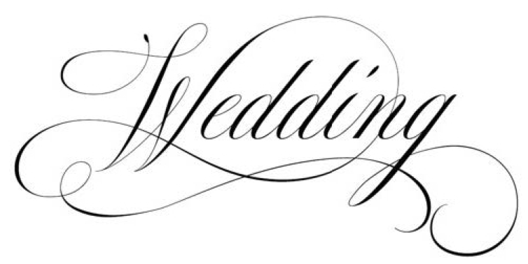
WITH Glyphs
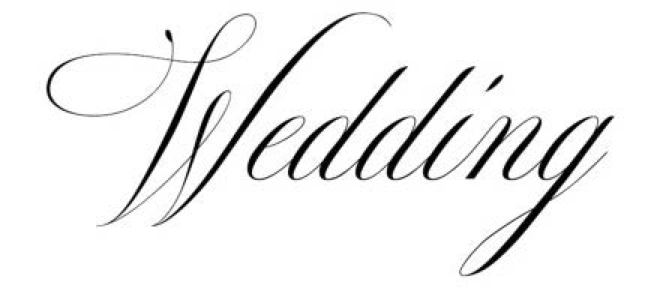
WITHOUT Glyphs
Leading (Led-ing)
In typography, leading(LED-ing) refers to the distance between the baselines of successive lines of type. The term originated in the days of hand-typesetting, when thin strips of lead were inserted into the forms to increase the vertical distance between lines of type.
Did you Know…
by Pam Doughty
There are many features hiding under the Font Panel gear menu?
The feature I found interesting today is the quick access to Glyph Variants.
OK so you read a couple of words you didn’t understand but please keep going. The words may make little sense but just try these two or three simple steps.
Using Pages I typed my name in 36 Point Zapfino. What I saw was the first line in the screenshot on this page.
The effect is OK but the capital letters lack something. I was looking for a font that had more life, more impact.
I opened the Font Panel… (Format>Font>Show Fonts – available in TextEdit, Pages, Keynote… in Mail it is Format>Show Fonts… or Command-T)
To obtain the fancy characters in the second line I selected the letter I wanted to alter then selected a Glyph Variant.
Ouch, there is that nasty term again. Sorry, I will not use it again. You select it by first clicking on the Gear icon and choose Typography from the drop-down menu. Open and select the options as shown in the screenshot.
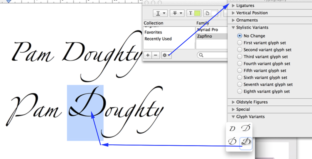
Glyph Variant
NOTE: This feature is not available for ALL fonts but it IS great for Zapfino. Try phrases like Happy Holidays or other greeting.
As a final example the following is my surname when ALL the characters have been altered as above.
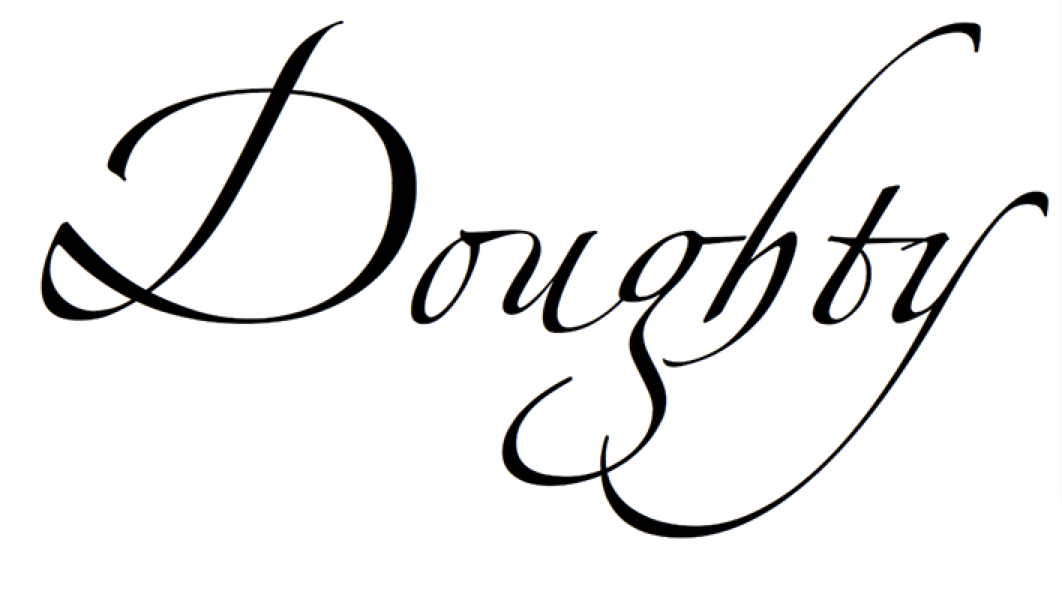
Glyph Variant to ALL characters
AUSOM News Sub Editor Mervyn Hayman-Danker notes: I used Zapfino for my design of the Entrance Arch to the “Victoria State Rose Garden”
Fonts from the Past
by Monty Maizles
A photo taken by AUSOM Member Monty Maizles when AUSOM relocated to a new building at Box Hill TAFE many years ago. (Yes… and take one of our courses on Typography and Legibility)
Printing in the 1960s
by Brad Smith
My Dad’s printing business in the 1960s was a smallish building. Probably 2 shop-fronts wide, the walls were lined with type cases. Each tray holding one font. And I mean one SIZE of one FONT. Like Times 10pt upper and lower. That took up a tray the size of which was about 1m x 80cm divided into 4cm ‘boxes’. We only had 2 or 3 fonts in TOTAL. These trays would take up one tower for one or two font sizes. If you wanted bold then you went to a different tray. When Helvetica arrived we had to remove part of the shop front to enable the new cases of type.
Dad was a genius at setting type. Letter by letter, he could set an A4 page in about an hour. And this was in 8pt! Of course he never looked at the type, he was too busy listening to the races on his transistor radio.
We had beautiful hand-made wooden letters for poster-style printing. Stained from years of inking and cleaning and carefully being placed back in their tray. I loved those letters.
The Machine we used for those wooden letters was also used for wedding invitations. Hand-set in a fancy font by Dad. He would print each invitation by hand with a rusty-coloured ink, and then he would ‘dust’ each invite with gold or silver dust and polish each with cotton wool. Beautiful stuff of times gone by.
My father couldn’t believe his ears when one day, after I’d been working there for 5 or more years, I dared to suggest “Why don’t we use a Serif Font like Times New Roman, with a Sans Serif Font like Helvetica in the one document.” He walked away disgusted, to say the least. We would NEVER see the day when you’d mix a SERIF font with a SANS SERIF font!
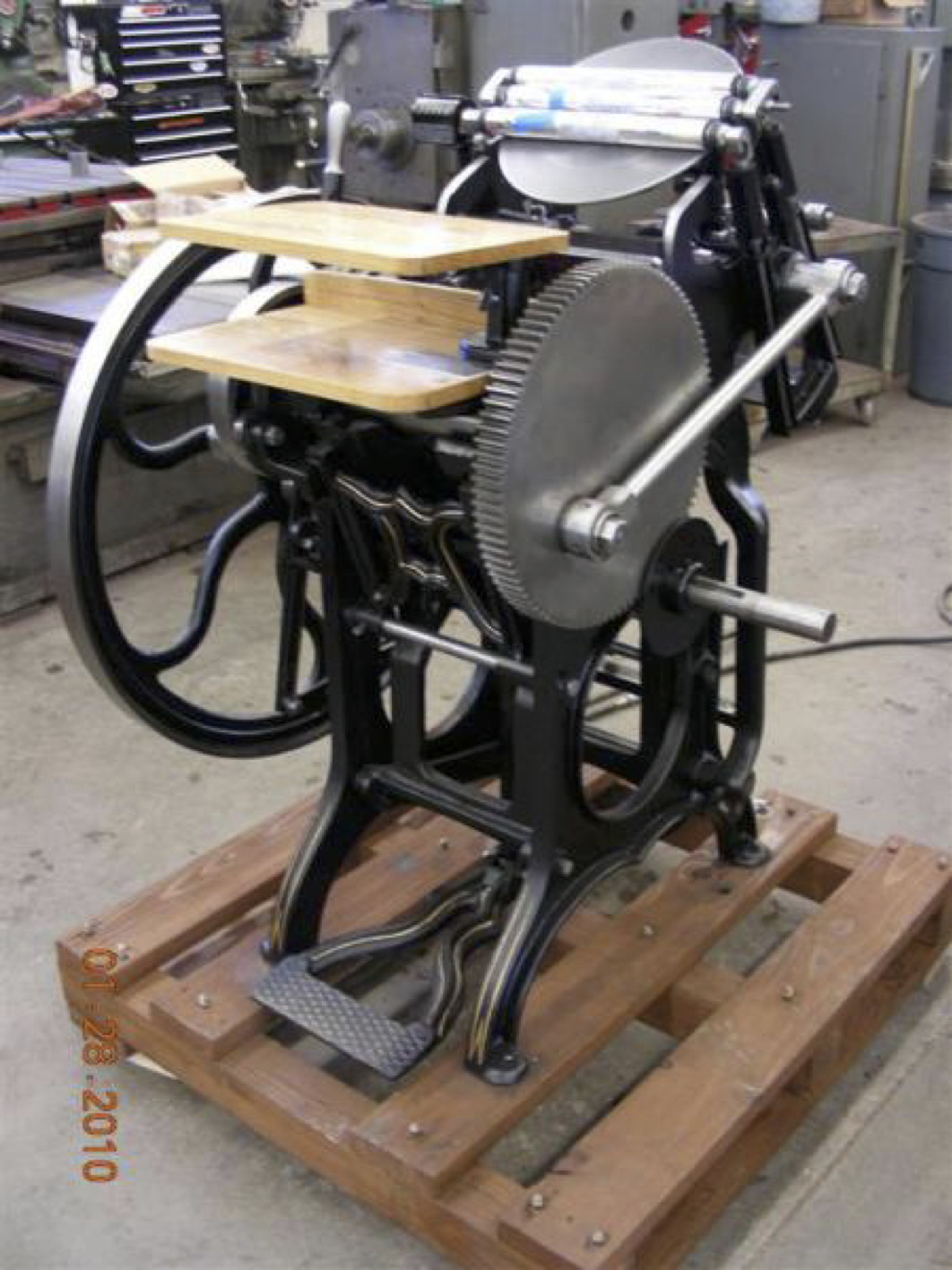
Our hand printing press was similar to this
Our hand printing press was similar to this. The tray of type stood upright in the middle of the Machine, the rollers rolled up and over the circular plate at the top. The plate contained the ink and rotated with the rollers. Each piece of paper was inserted by hand. There was no electricity involved, only a huge foot pedal to keep the monster rolling.

